QR Code Design Best Practices: Colors, Logos, and Readability
Design branded QR codes that still scan: contrast and colour rules, logos and error correction, quiet zones, module patterns, print sizes and file formats.
A plain black-and-white QR code works, but it can look out of place on carefully designed packaging, menus or posters. The good news is that QR codes are remarkably tolerant of design changes. The bad news is that the tolerance has limits, and you usually discover them after printing. This guide explains where those limits are and why.
The single most useful habit: test after every design change. Our generator runs an automatic scan test each time you edit, but always confirm with real phones on a printed proof too.
How scanners "see" a code
Understanding the scanner explains every rule below. A scanner:
- Converts the image to greyscale, then to pure black and white, using a brightness threshold.
- Looks for the three finder patterns (the big corner squares).
- Measures the module size from the timing patterns.
- Samples the centre of each module to decide dark or light.
- Uses error correction to repair modules it misread.
So what matters to a scanner is the brightness difference between dark and light modules, clear finder patterns, a clean edge, and reasonably sized modules. Colour, as such, matters only through brightness.
Colour and contrast
Dark on light
Keep modules darker than the background. Light-on-dark codes can work with some scanners, but many phone cameras still struggle with them. If your brand uses a dark background, put the code on a white or light panel.
Enough contrast
Pick a modules colour with strong brightness contrast against the background. A helpful way to check is the contrast ratio used in web accessibility guidelines (WCAG), which compares the relative luminance of two colours on a scale from 1:1 to 21:1. Our generator uses it to warn you:
| Contrast ratio (modules vs background) | What to expect |
|---|---|
| 7:1 and above | Excellent: navy, black, deep green, dark purple on white |
| 4.5:1 to 7:1 | Good for most uses |
| 3:1 to 4.5:1 | Risky in poor light or on older phones |
| Below 3:1 | Likely to fail: yellow, light grey, pastel colours on white |
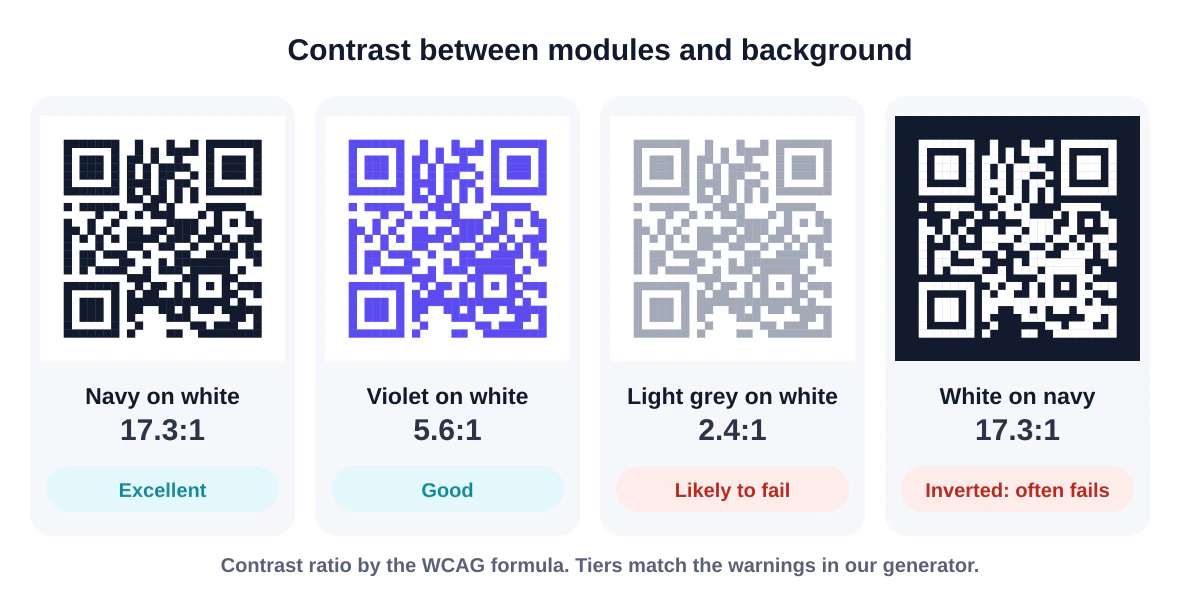
These thresholds are our practical guidance, not part of the QR standard, but they line up well with real-world results.
Colours that cause trouble
- Yellow, orange, light blue, pink modules on white: too little brightness difference.
- Red can be a problem for some laser barcode scanners, though phone cameras usually handle dark red fine.
- Metallic inks and foils reflect light unpredictably.
Gradients
Gradients are fine as long as the lightest point of the gradient still contrasts strongly with the background. A gradient from navy to violet works; one from navy to light lavender may leave part of the code too pale.
Coloured corner eyes
Colouring the three finder patterns in an accent colour is a popular and generally safe flourish, provided the accent is also dark.
Logos
A logo in the middle of a QR code physically covers modules. It works because of error correction: extra data that lets the scanner rebuild what's missing. There are four levels, from L (about 7% recovery) to H (about 30%).
Rules of thumb for logos:
- Use error correction H whenever you add a logo. Our generator switches automatically.
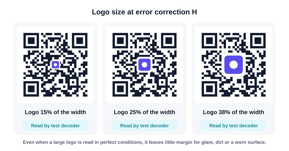
- Keep the logo to roughly 20–25% of the code's width, and run a scan test. Going beyond about 30% usually fails.
- Give the logo a clean background: clearing the modules behind it (an option in our generator) looks tidier and is more predictable than overlapping.
- Use a simple, high-contrast version of your logo. Fine detail disappears at small sizes anyway.
- Never cover the finder patterns or the area between them.
Remember that error correction is a shared budget. A logo uses up recovery capacity that would otherwise cover scuffs, dirt and glare. On things that get handled a lot (packaging, outdoor signs), keep the logo smaller.
Module patterns
Rounded, dotted and "fluid" modules all scan well, because scanners sample the centre of each module. A few tips:
- Dots and bars leave more white space, so the code reads slightly lighter overall. Print them a little larger than square codes.
- Rounded or fluid patterns are usually the safest stylish option.
- Corner-eye shapes (rounded, circular, leaf) are fine as long as they stay solid and clearly separated from the data.
The quiet zone
The empty margin around a code is called the quiet zone, and it's part of the code. The standard calls for four modules of empty space on every side. Scanners use it to find where the code ends. Common ways it gets lost:
- Text or borders placed right up against the code
- A busy photo background behind the code
- Cropping the code tightly in a layout program
On a plain background you can sometimes get away with less, but four modules is the safe default.
Size and density
How big to print depends on two things: scanning distance and module count.
- A common rule of thumb: the code's width should be at least one tenth of the scanning distance.
- For hand-held items, about 2 cm (0.8 in) is a practical minimum.
- Denser codes need more space. QR codes come in 40 versions from 21 × 21 to 177 × 177 modules. The more content, the higher the version and the smaller each module at a given size.
Ways to reduce density:
- Shorten the link (use a short path on your own domain).
- Remove unnecessary fields from contact cards.
- Use error correction M instead of H when there's no logo.
File formats
| Use | Best format |
|---|---|
| Print artwork, packaging, signs | SVG or PDF (vector) |
| Printers or sign makers who ask for it | EPS (vector) |
| Documents, slides, email | PNG at 1024 px or more |
| Websites | SVG (sharp on every screen) or PNG |
Never enlarge a small PNG in a layout program; edges blur and scanners misread them. Use a vector file and scale it as much as you like.
Placement and materials
- Flat surfaces scan best. On bottles and cans, keep the code small relative to the curve, or place it on a flat label area.
- Matte finishes beat gloss. Lamination and varnish cause glare under lights.
- Behind glass, reflections are the enemy; test at the actual angle people will stand.
- Screens work, but turn brightness up and avoid dark mode inverting the code.
A pre-print checklist
- Modules darker than the background, contrast comfortably above 4.5:1.
- Logo under about 25% width with error correction H.
- Four-module quiet zone, nothing intruding.
- Size appropriate for scanning distance and code density.
- Vector file supplied to the printer.
- Proof printed on the real material and scanned with at least two phones in realistic lighting.
- A label telling people what the code does.
If a printed code fails anyway, our troubleshooting guide helps you find out why.
Frequently asked questions
Can a QR code be white on black?
Technically yes, but many phone scanners can't read inverted codes reliably. Use dark on light whenever possible.
Does a coloured QR code scan slower?
Not noticeably, as long as contrast is strong.
Do gradients and logos work on all phones?
Within the limits above, yes for current phones. Test with older devices if your audience is likely to use them.
Summary
Keep it dark on light with strong contrast, respect the quiet zone, keep logos small with high error correction, size the code for its distance and density, use vector files for print, and test real proofs. Then go and make it beautiful in the generator.
Sources and further reading
QRaft Editorial Team
The people who build and maintain QRaft's tools. Every guide is written and checked against the tools on this site and the public specifications it cites. How we write and review guides.